Interior DesigN: CLOAKROOM - hILDENBOROUGH - kENT
The Project
As part of a multi-room interior design project in this characterful Edwardian home, we have been working with the family to introduce bold colour into key rooms. A snug and formal sitting room are complete, and the new phase of our project is to upgrade bathrooms. The downstairs WC was perfectly functional - but definitely lacking in personality - and we wanted this small (but important) space to keep pace with the rest of this colourful home. The wonderful thing about a cloakroom is that can act as a fantastic design secret - only discovered by guests who visit.


THE BRIEF
The brief for this project came from a Pinterest photo that our client had seen and saved - and the description that accompanied it was “not this - but you get the idea!”. The inspiration showed a small WC with bold teal walls with wainscoting panels, and William Morris “Strawberry Thief” wallpaper. Having a starting point (sometimes it’s just a scrap of fabric, a single cushion or a piece of art) helps us start the process, and use this as a launch pad.
In this house, we had already introduced a subtle navy thread - with navy and mustard in the snug (located next door to the cloakroom) linking with the navy cabinets in the kitchen (located on the other side of the cloakroom) - so it made sense to keep this colour running through this section of the house. We also had soft pink feature in the formal sitting room, and this is the perfect pairing for navy, allowing us to link the four spaces on the ground floor.
WHAT WE DID
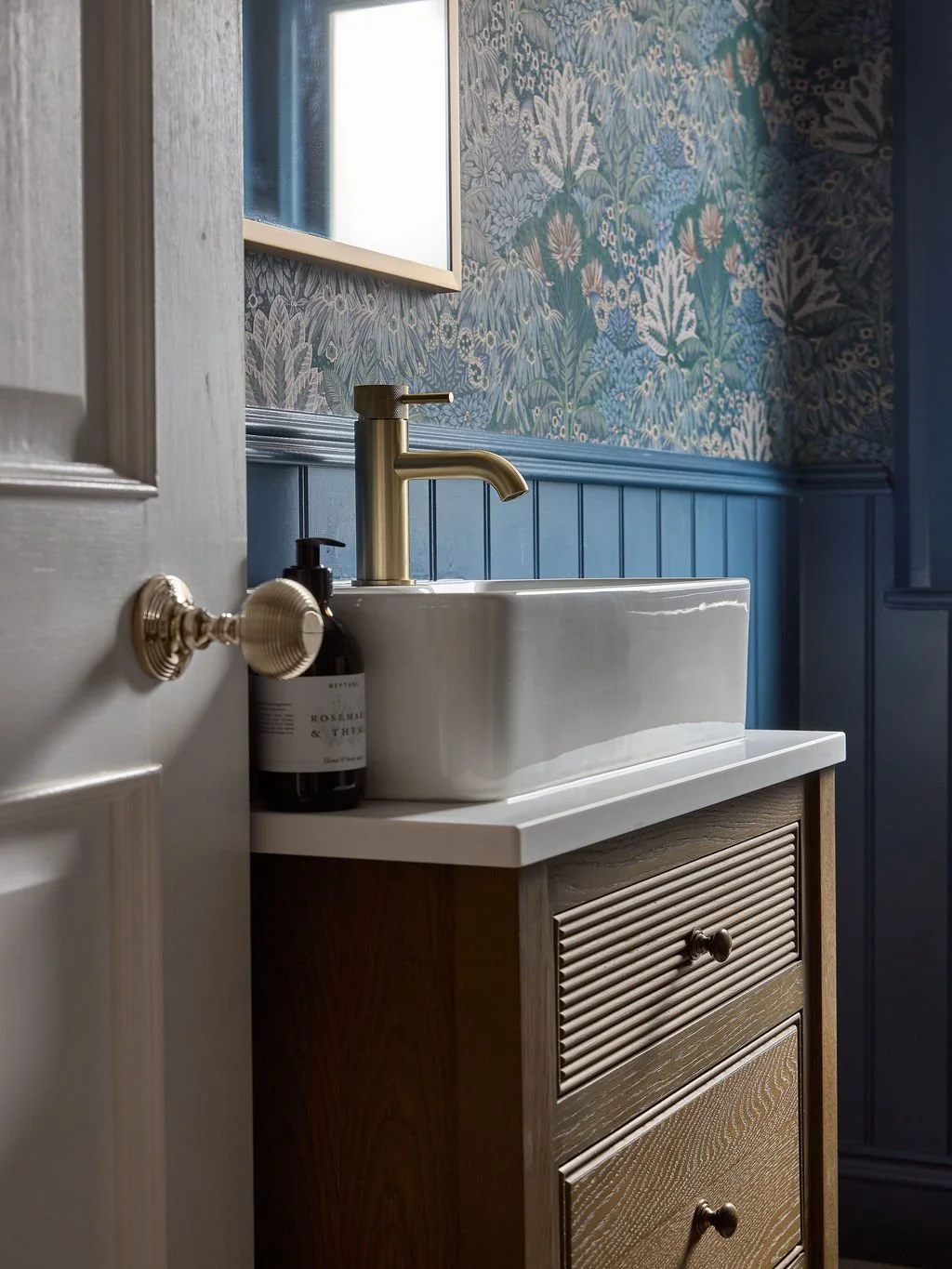
We switched out cold black and white floor tiles for a much warmer terrazzo-effect porcelain. The sand colourway we chose is a closer link to the wood flooring that runs through the hallway (directly adjoining the cloakroom), making the space feel much more connected to the rest of the house.
To deliver the impact and drama that our client loved in her inspiration photo, we installed tongue and groove panelling throughout the whole room. This treatment provides interest, texture, and also serves to break up the tall walls in this high-ceilinged (yet narrow) room. We painted the panelling and woodwork (including the back of the door so there was no big “break” in the scheme) in Farrow & Ball’s Stiffkey Blue which has a wonderfully traditional hue, but when used bravely across a larger area gives a modern look. Above the tongue and groove we installed Bloomsbury Botanical wallpaper which allowed us to inject several more colours into the scheme: pink, green, powder blue and a terracotta-red.
To continue adding warmer tones to the space, we changed the small graphite grey basin unit out for a bespoke dark wood cabinet, switched cool chrome hardware to warm brushed brass, and added wall lights for a more glamourous space (and softer lighting), and added rich rattan accessories.
Finally, dressing the window was a key step in softening the space. Bathrooms traditionally have lot of hard, smooth surfaces (think tiles, sanitaryware, towel rails, mirrors), so adding fabric is seriously transformational. We chose a delicate shade of soft pink to complement the pink floral detail in the wallpaper, and provide a clear contrast against all the dark blue.